

The Power of Color in Interior Design
Interior design is no longer limited to white walls or neutral tones. Today, homeowners are seeking solutions that can create an ambiance and reflect their style.
Bold tile colors have emerged as an expressive choice. They are not just useful surfaces; they are real decorative elements. They can add character to a room and change it into a lively and inspiring space.
Unlike neutrals, which fade into the background, bright hues instantly draw the eye. A bathroom wall with turquoise mosaics, a kitchen floor of red tile, or a bright yellow backsplash can change a room’s feel. These details serve as focal points around which the rest of the design can organize.
The Emotions Behind Color Palettes
Color psychology demonstrates that every hue carries a specific energy. Research published in Frontiers in Psychology shows that bright colors influence emotions and contribute to overall well-being. A bright red color boosts energy and friendliness. Perfect for a dining room where you want warmth and good talks.
Bold shades of blue, such as cobalt, bring serenity and focus, making them perfect for bold bathrooms or home offices. Yellow conveys optimism and joy, while green reconnects us with nature and creates balance.These effects go far beyond aesthetic preference. As a study on ScienceDirect highlights, a well-chosen color palette helps structure a room visually while shaping behavior. Choosing bold tile colors is not just about taste—it’s about designing with psychology in mind.

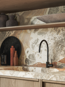
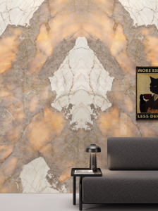
Product shown : Melody
Tiles as Lasting Decorative Elements
Tiles have an advantage over other decorative items like wallpaper or wood slats. They are durable and can reflect light well. You can repaint walls and wallpaper can peel, but colorful tile installations last as a decor element. It captures light, plays with reflection, and enriches a space every day.
As Journeyman HQ emphasizes, vivid tiles can transform how a space feels. A bathroom with green tiles evokes spa-like calm, while an entryway dressed in orange adds a warm and inviting welcome.
In a living room, a patterned tile floor goes well with a simple coffee table. Small items in neutral colors add balance and visual interest. Even a backsplash or a strip of tiles can bring a pop of color that gives more personality to your home.

Produit présenté : Jardin
Striking a Balance Between Boldness and Harmony
While bold tile colors stand out for their intensity, success lies in balance. Overusing color can overwhelm the eye, but thoughtful integration brings elegance.
Research on color harmony, including work on natural contrast, shows that the most pleasing combinations echo landscapes. Deep blue tiles with beige floors evoke the ocean and sand, while emerald green next to stone gray recalls forests and rock. These nature inspired palettes create coherence even when bold hues dominate.
Lighting also plays a crucial role. A red tile appears fiery under daylight, yet feels richer and more intimate under warm evening lights.The key is to pick one strong accent wall or decorative surface. Balance it with neutral colors, soft furnishings, and small items that match instead of clash. A black and white backdrop, for instance, makes a splash of cobalt or orange tiles feel striking yet modern.
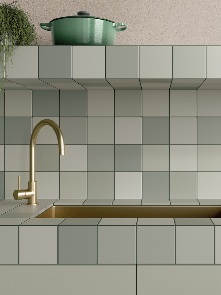
Produit présenté: Rubik
Italbec: Original Ideas for Bold Color Design
The collections offered by Italbec showcase original ideas for bringing bold colors into interiors. The Melody collection mixes patterns and contrasts. It turns walls into art, adding visual interest to living rooms and kitchens.
The Jardin collection is nature inspired, bringing freshness and vitality into minimalist settings with greens and floral tones. Rubik is fun and modern. It uses color blocks to make an accent wall that stands out in any room.
These examples show that bold tiles aren’t just for kitchens or bold bathrooms. They can enhance dining rooms, brighten entryways, or even elevate terraces. They can replace delicate wallpaper, match wood slats, or work well with textiles and furniture to add character to the home.
Color as a Reflection of Identity
Colors are never neutral—they mirror emotions, culture, and personal values. As highlighted in an EJTAS publication, colors shape how we perceive space and how we connect with it. Choosing bold tile colors is more than following a trend—it is a declaration of identity and personality style.
In a world where many interiors rely on predictable neutrals, bold hues stand out. They allow homeowners to express themselves, tell a story, and turn any space into a true reflection of their lifestyle. A small backsplash, a feature wall, or a fully tiled floor can add personality to your home. These choices make your space unique.
Conclusion: Italbec, a Partner for Unique Interiors
Bold tile colors are more than decorative choices. They are a way to create an ambiance, shape a room’s character, and add individuality to a home. They help you add personality to your space, whether through a colorful accent wall, a patterned floor, or a vivid backsplash.
At Italbec, this philosophy is central. The company has combined expertise and creativity to offer more than materials.
With collections like Melody, Jardin, and Rubik, Italbec proves that tiles can be bold yet refined, expressive yet harmonious. Italbec is more than just a supplier.A trusted partner helps clients make their vision real. They transform houses into inspiring homes. Choosing Italbec means choosing design as an element of décor and as a reflection of your personality.